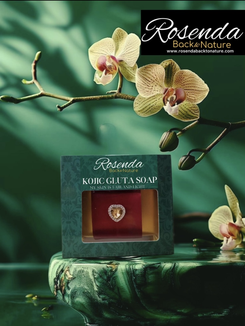
The green box packaging with natural leaves design and gemstones for Rosenda Back to Nature Soaps holds deep symbolic, aesthetic, and functional significance, aligning with the brand’s ethos of sustainability, cultural pride, and connection to nature. Here’s a breakdown of its importance:
1. Symbolism of the Green Box & Natural Leaves Design
-Nature-Inspired Aesthetics:
The green color evokes freshness, eco-friendliness, and the lush tropical landscapes of the Philippines. Paired with natural leaf motifs, it visually communicates the soap’s plant-based ingredients (e.g., coconut oil, calamansi, lemongrass) and its commitment to environmental stewardship.
– Cultural Connection:
The leaves may reflect indigenous Filipino flora, celebrating the country’s biodiversity and traditional herbal remedies. This ties the product to its Philippine heritage, appealing to global customers seeking authentic, locally rooted goods.
-Sustainability Messaging:
Green packaging is universally associated with eco-consciousness. Combined with minimalist, biodegradable materials (if applicable), it reinforces Rosenda’s dedication to reducing plastic waste and supporting a circular economy.
2. Incorporation of Gemstones
– Luxury and Earth’s Bounty:
Gemstones (e.g., placed as decorative accents or embedded in the packaging) symbolize the Philippines’ “mineral richness”(gold, copper, and rare stones) and the idea of “nature’s treasures.” This elevates the product’s perceived value, positioning it as a premium, artisanal item.
– Holistic Wellness Association
Gemstones are often linked to healing properties in cultural traditions (e.g., jade for balance, amethyst for calm). This subtly aligns with the soap’s promise of natural skincare benefits, creating a narrative of *harmony between body and environment*
-Unique Brand Differentiation
The gemstone element distinguishes Rosenda from generic eco-friendly brands, offering a tactile, visually striking unboxing experience that resonates with socially conscious luxury shoppers.
3. Functional & Marketing Advantages
-Shelf Appeal
The vibrant green box with intricate leaf patterns and gemstone accents stands out in crowded markets, attracting buyers drawn to artisanal, nature-themed products.
– Storytelling Tool
The packaging tells a story about the Philippines’ natural wealth—its forests, minerals, and traditional craftsmanship. This can be leveraged in marketing campaigns to emphasize authenticity and ethical sourcing.
-Instagram-Worthy Design:
The visually appealing packaging encourages social media sharing, amplifying brand visibility among eco-conscious millennials and Gen Z consumers.
4. Alignment with Global Trends
-Eco-Luxury Demand:
Combines sustainability (green materials) with opulence (gemstones), catering to the growing market for products that are both ethical and indulgent.
-Cultural Authenticity:
Showcases Filipino identity through design, tapping into consumer interest in supporting local communities and preserving traditional practices.
Conclusion
Rosenda’s packaging is far more than a container—it’s a multisensory expression of the brand’s mission. By blending Filipino natural resources (greenery, gemstones) with eco-friendly values, the design:
– Celebrates the Philippines’ ecological and cultural heritage.
– Appeals to global shoppers seeking ethical luxury.
– Reinforces the soap’s promise of purity, wellness, and environmental care.
This thoughtful packaging not only protects the product but also transforms it into a symbol of conscious living making every purchase a small act of connection to nature and Filipino artistry. 🌿✨


